Why Your Analytics Dashboard Lies: Understanding Data Architecture to Trust Your Marketing Metrics
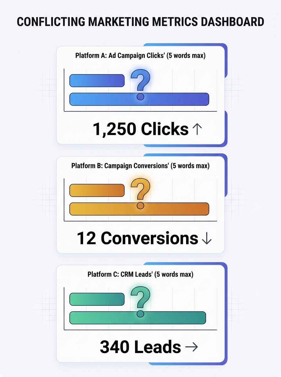
Facebook told us we drove 100 sales from a campaign. GA4 said we drove 10. Same campaign, same week, same product. And my CMO wanted to know which number to put in the board deck.
Why Your Analytics Dashboard Lies: Understanding Data Architecture to Trust Your Marketing Metrics
Facebook told us we drove 100 sales from a campaign. GA4 said we drove 10. Same campaign, same week, same product. And my CMO wanted to know which number to put in the board deck. That moment forced me to stop treating dashboards as truth and start treating them as arguments, each one shaped by the architecture underneath it.
This isn't a data problem. It's a measurement architecture problem, where the way data is structured, connected, and interpreted fails to provide the clarity you need for real decisions. Your dashboard isn't lying maliciously. It's lying structurally. And until you understand why, every budget conversation you have is built on sand.
The Trust Crisis Is Worse Than You Think
Here's a number that should alarm you: 64% of B2B marketing leaders don't trust their own company's marketing measurement for decision-making. Not competitors' data. Not third-party benchmarks. Their own numbers.
Gartner's research quantifies the cost of this distrust at $12.9 million annually per organization in erroneous decisions, inefficiencies, and compliance risk. But I'd argue the real cost is behavioral. When marketers don't trust their data, they stop using it. They fall back on gut instinct, HiPPO decisions (highest-paid person's opinion), and whatever the last vendor pitch told them.
The result? Teams collect more data than ever while making worse decisions. If you've noticed hidden errors silently eating into your marketing ROI, this is the root cause.
The Five Structural Reasons Your Dashboard Misleads
Your analytics data sources don't just report reality. They construct a version of reality based on how they're built. Here are the five architectural flaws I see in almost every marketing stack.
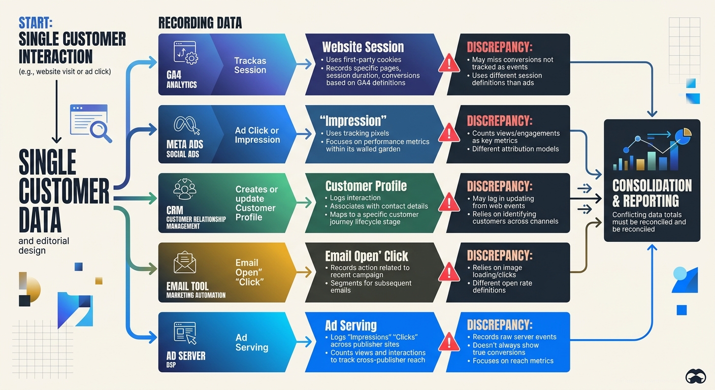
1. Identity Fragmentation Across Touchpoints
Your buyer browses on their phone during lunch, clicks an ad on their work laptop, and converts on a tablet at home. Most analytics systems treat these as three separate people. Three separate sessions. Three different stories about what drove the sale.
This identity fragmentation distorts everything downstream. Attribution models can't assign credit accurately when they can't connect the dots. Your paid team thinks the ad worked. Your email team thinks the nurture sequence closed the deal. Both are looking at fragments of the same person.
2. Platform-Centric Reporting Bias
Every ad platform is an unreliable narrator. Meta, Google Ads, LinkedIn, TikTok: they all run proprietary attribution models inside closed ecosystems. Each one is incentivized to take maximum credit for conversions.
That 10x gap I mentioned at the top? It happens because Facebook uses view-through attribution by default (counting anyone who saw your ad and later converted), while GA4 uses click-through attribution with different lookback windows. Neither is wrong, exactly. But neither is the whole truth, either.
When a 90-day lookback window in Google Analytics is compared against Meta's 7-day default, you can see 40% more conversions falsely attributed to paid search. That's not a rounding error. That's a budget-wrecking distortion.
3. Tagging Errors and Data Decay
I once audited a client's GA4 setup and found 14 different event names for what was essentially the same action: form submission. "form_submit," "formSubmit," "submit_form," "lead_form_complete" and ten creative variations. Each one created by a different developer or agency over time, with zero governance.
This is what makes data integration errors so insidious. They don't announce themselves. Your dashboard still renders. Charts still move. But the numbers underneath are fractured, duplicated, or incomplete. If you've ever wondered why your analytics data doesn't match reality, inconsistent tagging is usually the first place to look.
B2B contact data decays at roughly 70% per year as people change jobs, companies rebrand, and email addresses go stale. Without automated validation, your CRM is rotting in real time.
4. Aggregation Hides the Real Story
Your overall conversion rate is 3.2%. Looks stable. Looks fine.
But segment it by channel: organic is at 5.1% and climbing. Paid social is at 0.8% and falling. Email is at 7.4% but only because you're measuring against an increasingly small engaged list. The aggregate number told you nothing. The segments tell you everything.
Aggregated metrics are the comfort food of analytics. They feel nourishing but provide little nutrition. Strong retention numbers can mask catastrophic churn in your most valuable customer segment. This is precisely why understanding your bounce rate benchmarks at a granular level matters so much more than staring at site-wide averages.
5. The ACID Problem in Marketing Analytics
Here's where it gets technical in an important way. Traditional databases guarantee something called ACID transactions: Atomicity, Consistency, Isolation, Durability. Every transaction either completes fully or doesn't happen at all. Your bank account works this way.
GA4 doesn't work this way. No web analytics tool does. Your marketing stack data flow is fundamentally eventual rather than transactional. Data arrives late. Sessions get stitched together after the fact. Consent management tools block some events but not others. Sampling kicks in at high traffic volumes.
Understanding why ACID transactions and GA4 operate on completely different paradigms explains so much of the frustration marketers feel. You're expecting bank-account accuracy from a system architecturally incapable of providing it.
What Good Data Architecture for Marketing Actually Looks Like
Knowing the problems is useful. Fixing them is better. Here's the framework I use with every marketing team I advise.
Step 1: Start with Questions, Not Metrics
Most teams build dashboards backward. They pull in every available metric, arrange them in a grid, and call it a day. Then nobody uses it.
Instead, start with the three to five decisions your team makes most frequently:
Which channels should get more budget this quarter?
Is our content strategy driving qualified pipeline?
Where are we losing people in the conversion funnel?
Build each dashboard view around answering one specific question. Everything else is noise. This approach pairs well with having a clear content marketing strategy in the first place, because if you don't know what you're trying to achieve, no dashboard will help.
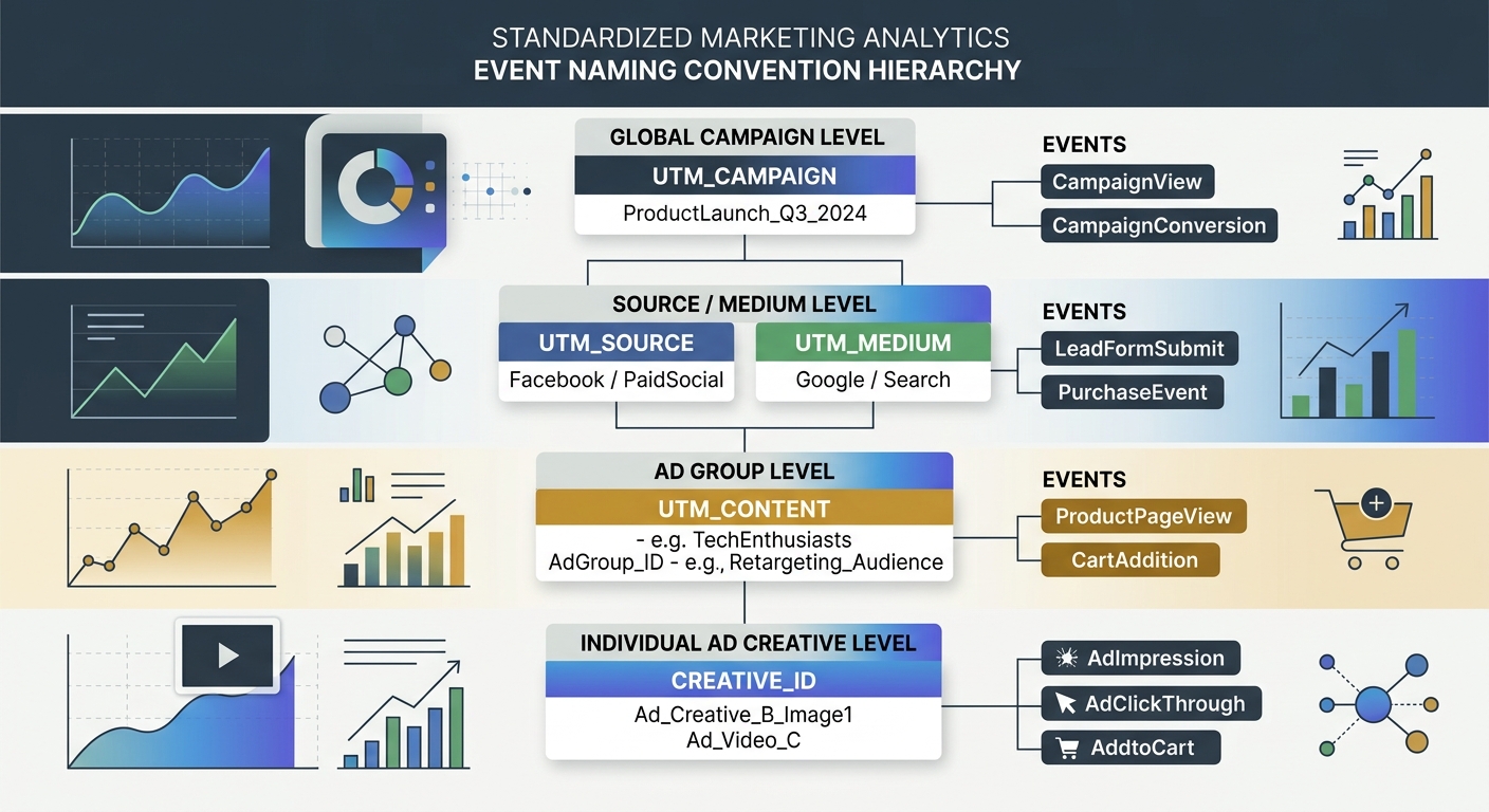
Step 2: Standardize Your Naming and Tracking
One automotive marketing agency standardized their tracking setup across 70+ client websites using consistent templates. Reporting accuracy improved by 40%, and setup time dropped from 8-10 hours to 2-5 hours per site.
Create a tracking taxonomy document. Define every event name, every UTM parameter structure, every conversion action. Make it the law. When a new agency or developer joins the team, this document is their first read.
Step 3: Build a Centralized Data Layer
Your CRM says one thing. Your ad platforms say another. Your email tool has its own version of events. The solution isn't to pick a winner. It's to build a centralized data layer that ingests from all sources, deduplicates, validates, and normalizes.
This is what proper data architecture for marketing means in practice. As Analytic Partners puts it, data doesn't lie, but seemingly similar marketing metrics will conflict with each other. A centralized layer doesn't eliminate the conflicts. It makes them visible and reconcilable.
Modular architectures that scale with your business needs are the goal here. Don't try to boil the ocean. Start with your three most important data sources, get those clean and connected, then expand.
Step 4: Show Your Work
Every dashboard should display data freshness timestamps. When was this data last updated? What's the known latency? What's excluded?
67% of users lose confidence in analytics when dashboards show stale data. A simple "Last updated: 2 hours ago" label prevents more confusion than you'd expect. Transparency builds trust. If your site performance metrics are delayed, say so.
Step 5: Embrace Directionality Over Precision
This is the mindset shift that changed everything for me. Analytics will never be 100% accurate. Ad blockers, cookie consent refusals, cross-device gaps, and sampling all introduce noise. Chasing false precision is a losing game.
Instead, optimize for directionality. Are your numbers going up or down? Is the trend accelerating or decelerating? Is channel A consistently outperforming channel B, even if the exact magnitude is uncertain?
Good enough data with clear direction beats perfect numbers with no insight. Every time.
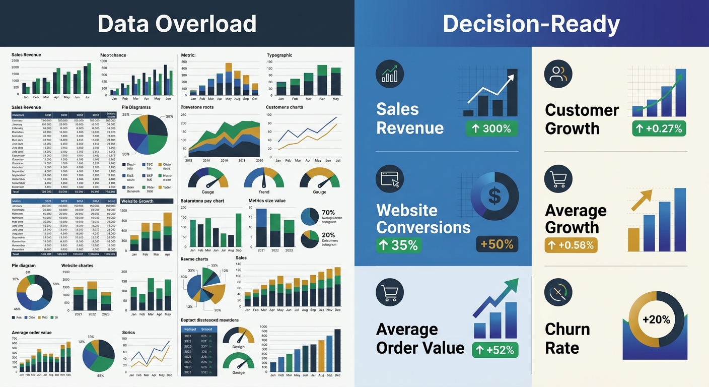
The Five-Second Rule for Dashboard Design
One tactical framework I'll leave you with. Apply the five-second rule to every dashboard you build: can a user grasp the main insight within five seconds of looking at it?
If not, you have a design problem on top of your data problem. Research shows 34% of users find dashboards too cluttered, and 40% can't make decisions due to information overload. Use these principles:
Place the most important KPI in the top-left position
Use size and color to create visual hierarchy (bigger = more important, red = needs attention)
Cap each dashboard view at five to seven visualizations maximum
Build role-specific views: your CMO doesn't need the same dashboard as your campaign manager
The Practical Takeaway
Stop treating your analytics dashboard as a source of truth. Treat it as a source of evidence that needs interpretation, context, and architectural integrity to be useful.
Your action items for this week: audit your event naming conventions for consistency, normalize attribution windows across your top three platforms, and add data freshness timestamps to every report your team uses. These three changes won't make your dashboard perfect. But they'll make it honest. And honest data, even imperfect data, is what actually drives better marketing decisions.

Sarah Chen
SEO strategist and web analytics expert with over 10 years of experience helping businesses improve their organic search visibility. Sarah covers keyword tracking, site audits, and data-driven growth strategies.
Frequently Asked Questions
- Why do Facebook and Google Analytics show different conversion numbers for the same campaign?
- Facebook and Google use different attribution models and lookback windows by default. Facebook uses view-through attribution with a 7-day window, while GA4 uses click-through attribution with longer lookback periods. When these settings aren't normalized, the same campaign can show a 10x difference in reported conversions.
- What is identity fragmentation in marketing analytics?
- Identity fragmentation occurs when a customer interacts with your brand across multiple devices or touchpoints (phone, laptop, tablet) but analytics systems treat each session as a separate person. This prevents accurate attribution because each platform sees only a fragment of the complete customer journey.
- How should I standardize event naming in Google Analytics?
- Create a tracking taxonomy document that defines every event name, UTM parameter structure, and conversion action as a standard. This prevents situations like having 14 different names for the same action (form submission), which fragments your data and destroys reporting accuracy.
- Why are aggregated marketing metrics misleading?
- Aggregated metrics hide critical performance differences between segments. An overall 3.2% conversion rate might mask organic at 5.1%, paid social at 0.8%, and email at 7.4%—each requiring different strategic decisions. Segment-level analysis reveals the real story that aggregate numbers conceal.
- What is a centralized data layer in marketing analytics?
- A centralized data layer ingests data from all sources (CRM, ad platforms, email tools), deduplicates, validates, and normalizes the information. This creates a single source of reconciled truth rather than forcing teams to choose between conflicting numbers from different platforms.
- How can I improve dashboard trustworthiness?
- Add data freshness timestamps to show when data was last updated and known latency, display data at the most actionable segment level rather than aggregates, and apply the five-second rule—ensuring users can grasp the main insight within five seconds of viewing it.
- What is the ACID problem in marketing analytics?
- Traditional databases guarantee ACID transactions where data either completes fully or not at all, but marketing analytics tools like GA4 operate on eventual consistency instead. Data arrives late, sessions are stitched together after the fact, and sampling creates unavoidable inaccuracy—making bank-account precision impossible.
- Why should I build dashboards around questions instead of metrics?
- Most teams pull in every available metric, creating cluttered dashboards nobody uses. Instead, identify the 3-5 decisions your team makes most frequently (like budget allocation by channel) and build each dashboard to answer one specific question, making it actionable rather than overwhelming.
Explore more topics